When you look at a bitten apple or a sleek swoosh symbol, don’t they remind you of popular brands? Yes, you guessed them right, Apple and Nike. That’s the power of a well-designed creative logo. It becomes the visual cornerstone of your brand that acts as an ambassador that represents your brand just by having looked upon it.
Creating a logo for a brand that not only looks visually appealing but also captures the true essence of the brand is not an easy job. To design an amazing logo you would require careful thought, a touch of creativity, and a great understanding of the brand. Above all, you must have a better understanding of the brand you are making the logo for.
In this article, I’ll explain invaluable tips and strategies that will empower you to design a logo that not only catches the eye but also resonates deeply with your target audience.
Importance of Good Logo Design
A good logo is crucial in creating the first impression of your brand. It speaks volumes about your business. Why is a Good Logo Crucial? An effective logo stimulates instant recognition, creates differentiation in the market, and fosters customer loyalty. But what makes a logo ‘good’?
A simple yet eye-catching logo, memorable, versatile, timeless, and most importantly, relevant to your brand is considered a successful one.
Before we dive into the nitty-gritty of logo design, it’s important to take a step back and understand your brand. Your logo should encapsulate your brand’s personality, values, and unique selling points. A strong understanding of your brand makes the logo design process smoother and ensures that the final product is a perfect reflection of your brand.
Logo Design Basics
With the foundational understanding of the brand and the significance of a logo in place, it’s time to explore the tips and techniques that can help you design a compelling logo. Let’s start with the basics!
Tip 1: Keep it simple
A good logo is easy to remember and recognize. It should be simple and clean, without too much clutter. This will make it easier for people to remember your logo and associate it with your brand.
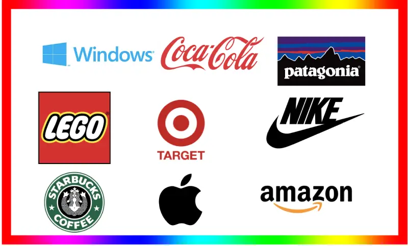
For example, Apple’s Logo, Microsoft Windows Logo, and there are many such examples where brands used simple logos and their logos became the identity of the brand.
![]()
![]()
Tip 2: Make it memorable
Your logo should be unique and different from your competitors’ logos. It should be something that people will remember after they see it just once. This could mean using a distinctive font, color scheme, or symbol. Don’t just copy some other brand’s logo ideas. Make something of your own, and keep that simple to make it memorable.
For example, the Nike logo is a simple swoosh. It’s instantly recognizable, and it’s associated with Nike’s brand of athleticism and movement.
![]()
Tip 3: Make it Versatile
Your logo should be able to adapt to different sizes and applications. It should look good on a business card, a website, a billboard, or even a t-shirt. This will help you to build brand recognition across all of your marketing materials.
For example, the Coca-Cola logo is a simple red and white script. It looks good in a variety of sizes and applications, from its iconic bottle to its website to its advertising.
Tip 4: Design with longevity in mind
Your logo should be timeless. It should be a design that will still look good in 10 years, even if trends change. This means avoiding using trendy fonts or colors that will quickly go out of style. While making the logo, it is very important to use evergreen fonts, colors, and styles rather than going for a trendy one because trendy things go out of style in a few years. So, that you should keep in mind.
For example, the Lego logo has been around for over 60 years. It’s a simple, colorful logo that has stood the test of time.
Tip 5: Incorporate your brand identity.
Your logo should reflect your brand’s personality and values. If your brand is all about being eco-friendly, for example, your logo should incorporate some elements of nature. This will help people to understand what your brand is all about at a glance.
For example, the Patagonia logo is a simple mountain range. It’s a natural symbol that reflects Patagonia’s commitment to the outdoors.
Tip 6: Get creative with colors and shapes
Colors and shapes can evoke emotions and feelings. So, choose them carefully to reflect the message you want to convey with your logo. For example, red can evoke feelings of excitement and passion, while blue can create a sense of trust. Shapes also carry meanings. Circles can suggest community and unity, squares can imply stability, and triangles can symbolize power.
For example, the Starbucks logo is a green mermaid with a siren’s tail. The green represents nature, and the siren represents temptation.
Tip 7: Typography matters
The typeface you choose for your logo speaks volumes about your brand. So, choose a font that aligns with your brand’s character. A luxury brand might opt for a sophisticated serif font, while a tech start-up might go for a clean and modern sans-serif.
For example, the Nike logo uses a simple sans-serif font that reflects the brand’s athletic and modern image.
Tip 8: Aim for uniqueness.
Your logo should set you apart from your competitors. It should be distinctive and different from what they’re using. But remember, being unique doesn’t mean being overly complex. It’s about being different in a way that’s still relevant to your brand.
For example, the Target logo is a simple red bull’s-eye. It’s instantly recognizable, and it’s different from any other logo in the retail industry.
Tip 9: Test your logo
Once you’ve designed your logo, test it out. Get feedback from colleagues, friends, and most importantly, your target audience. This can provide valuable insights and help you to refine your logo before it goes live. You can do this by putting out the design in your social media community and asking everyone’s opinion.
For example, you can create a mockup of your logo and show it to people in your target audience. Ask them what they think of the logo, and what emotions it evokes in them. This feedback can help you to make sure that your logo is effective in communicating your brand’s message.
Tip 10: Choose a Designing Tool
Now, you know everything that helps you get started with making a logo for a brand. But, you need a tool in which you design the logo, and the best ones I can recommend are CorelDraw, Photoshop, and Illustrator. Moreover, people are making logos in Figma and Canva as well. You can try any tool as per your requirements.
To Sum Up
So, after journeying through the landscape of logo design, we’ve learned a number of essential tips:
- Simplicity is king. Keep your design clean and uncluttered for maximum impact.
- Strive to make your logo memorable. It should stand out in the minds of consumers.
- Ensure your logo is versatile. It should look good in all sizes and across all platforms. Here, tools like Icons8’s Background Remover come in handy for creating flexible logos.
- Design with longevity in mind. Choose a timeless style over passing trends.
- Your logo should encapsulate your brand identity. Make sure it accurately represents your brand’s ethos and values.
- Be conscious of the role of colors and shapes. These can elicit specific emotions, so choose them carefully.
- Don’t neglect typography. The right font speaks volumes about your brand.
- Aim for uniqueness. Your logo should set you apart from your competitors.
- Finally, don’t forget to test your logo. Gather feedback to refine and perfect your design.
By adhering to these key principles, you can create a logo that is not only visually appealing but also truly encapsulates the essence of your brand. The path to a successful logo may require some trial and error, but with these guidelines, you’re well-equipped to make a logo that shines.
Conclusion
Designing a good-looking logo is a blend of creativity, brand understanding, and strategic thinking. Armed with these tips, you’re well on your way to creating a logo that not only looks good but also resonates with your audience and stands the test of time.


Add Comment