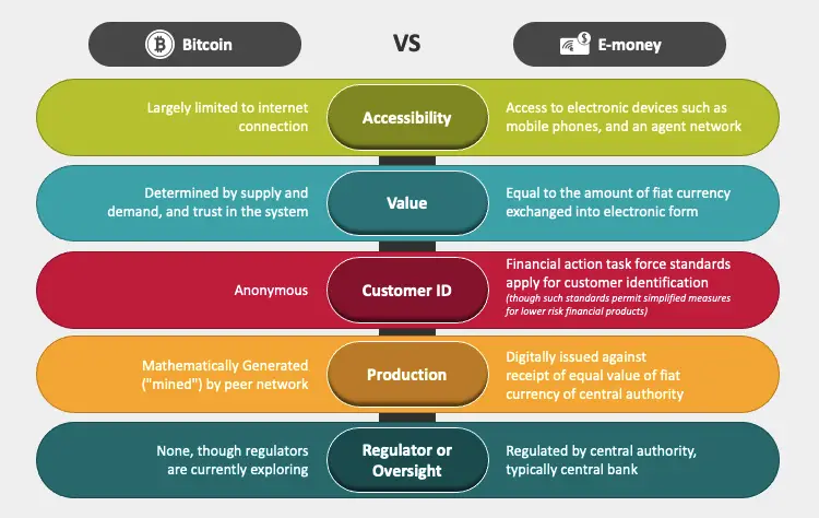
Data has become increasingly important in present times and is used to drive results in almost every sector. Be it education, business, health, or politics; data is the backbone of every industry for making decisions and ensuring development. It is used as an important tool to persuade potential clients and investors, engage the audience, prove theories, etc.
However, incorporating data in your presentations can be quite a challenge as numbers and figures seem boring if not presented well. Thus, here are a few tips that will help you present data like a pro and notch up your presentation game!
Tips for Presenting Statistics and Analytics
1. Harness the Power of Graphics
Graphics are the most powerful tools when it comes to presenting data. They can make your numbers come alive and add life to your presentations. If you just put all the statistics and analytics just like that, they will look boring but when you put them in a good manner, they will in fact look more interesting.
Graphics and visuals can break down intricate information and make them more accessible and easier to understand for the audience. They can convey messages much more efficiently than words or numbers.
Here are a few things to keep in mind while using graphics:
- Make sure that your visuals are in alignment with the text and do not overlap it.
- Craft your graphics in accordance with your brand palette or with the theme of your presentation.
- Do not use extremely large texts or effects that may overshadow your visual.
- Use fonts that are clear and can be read clearly on bigger screens as well.
- Double-check the source of your statistics to avoid inaccuracy.
Crafting graphics from scratch can be extremely time-taking and burdensome. Thus, we suggest using expert-designed graphics that can be completely customized and added easily to your PowerPoint presentation slides. You can use them to make your presentations look stunning and extremely professional.
2. Weave a Story Around Your Data
Data alone cannot captivate your audience for a long period. It can make your presentations seem dull if it isn’t backed by an intriguing narrative.
Thus, you can start by weaving a story around your data to make it more compelling and interesting. This will add more value to your presentation and make it much more meaningful.
For instance, if you are presenting data related to an increase in visitors to your website, you can share a story of how you designed the interface of the website, keeping the latest trends and potential customers in mind, and different ways people reached your website.
3. Use Real-Life Examples to Make it Interactive
Using real-life examples to showcase your data is an excellent way to make your presentations engaging and interactive. Presenting data in a way that resonates with the audience will allow them to connect more with it and retain it for a long time period.
For instance, you can harness the power of data-driven charts in your presentations. If you are presenting an annual report of your company to potential investors or current stakeholders, you can use these charts and present multiple fields of data in an organized and meaningful manner.

4. Pick the Correct Graph
Selecting an appropriate graphic for your data is paramount for the success of your presentation. The main purpose of displaying statistical figures visually is to provide ease to the audience to comprehend the information.
Picking incorrect formats or using excessive graphics on your slides can make your presentation tedious and overwhelming. It can draw away the attention of your audience and lead to disappointments.
While choosing a graph, you must research it and then incorporate it into your slides. Even though there are many types of graphics, such as charts, graphs, tables, diagrams, etc., it is crucial to pick the one that fits into your numbers well.
For instance, a bar graph can be used to show a comparison between two or more things, while a line graph may be a better option for depicting change over time.

Depicting comparisons using tables, or various graphical representations, make your presentation look better and more professional.
5. Keep Your Eyes on the Audience, Not on Your Data
Presenting data poorly can ruin your reputation and make your presentations seem dull and uncompetitive. Hardly anyone would be able to connect better while looking at your presentation
One common mistake made by presenters is that they focus excessively on their slides and read data directly from the source. Instead of looking at the numbers, you must keep your eyes on the audience, who can understand much better when you maintain eye contact with them.
However, you shouldn’t completely ignore your slides. You can glance at them once in a while during the presentation as a reference point and emphasize your message to the audience.
Conclusion
In today’s time, a huge amount of data is available to us that can be used in our day-to-day presentations. However, creating slides where data speaks more than words is an art that can be mastered with practice and experience. While PowerPoint is the most commonly used presentation platform, there are several PowerPoint alternatives like Google Slides, Prezi and Canva that can help create engaging and interactive presentations.
We hope this article helps you incorporate data in your presentations like a maestro! Let us know what you think about it in the comments section below.


Add Comment