If you are in a business, the growth or dip in your business is best analyzed with the help of a line chart. A line graph or a line chart has always been something widely used in the business circles. Have you ever give a thought to find how to make a line graph in Google Sheets? We thought of checking out and letting you find the best options to add a line to chart in Google Sheets.
What is a Line Graph?
A line graph is simply a graph that represents the data in the form of a series of points that you would mark on a plot. Connecting the dots or points creates a line and that is exactly why this type of chart is referred to as a Line Chart.

A line chart is also referred to by several other names. A few prominent names used for line graphs include line plots, line charts, and curve charts. It provides you an easy to use functionality in letting you view the data in relation to different parameters and compare them together.
There are several ways to create a Line chart, and one involving the use of Google Sheets can prove to be extremely effective in more ways than one.
How to Make a Line Graph in Google Sheets?
Creating a Line graph on Google Sheets can be quite a tedious and complex task. If you are not aware of how to work with a line chart and Google Sheets, it can prove to be a tough task. However, if you are able to learn the complexities once, creating a Line Graph can prove to be quite simple and easy.
Here are a few of the steps that you can opt for in how to make a line graph:
Step 1:
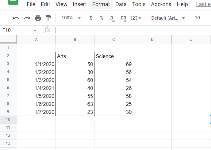
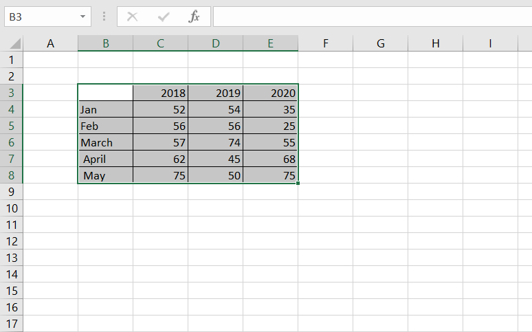
Enter the data you want to plat on a Google Sheet. Do note that this should be the most essential step in how to create a line graph. The values entered in this sheet are transferred onto the line graph.
Step 2:
Select the data you want to create a chart with. In our case, we will create a chart with the data table. Simply select the table you want to create the line graph for.
Step 3:
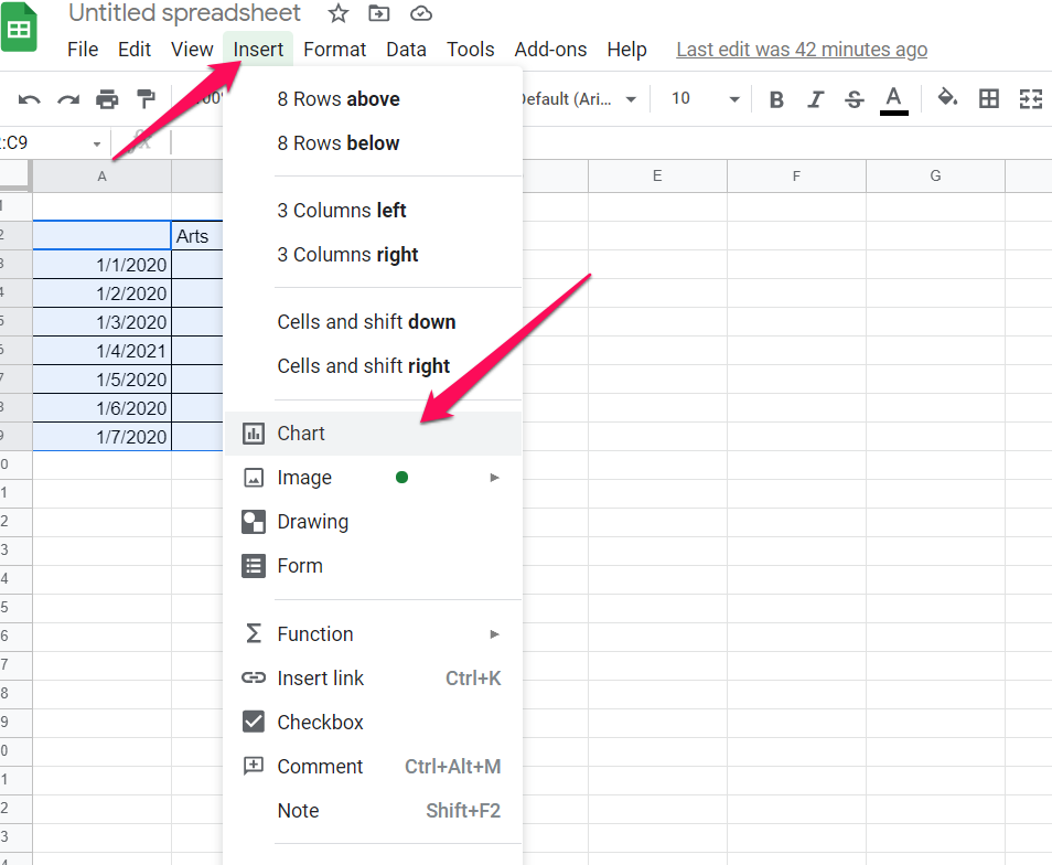
Click on Insert -> Chart. If this is your first time that you are plotting a chart, Google Sheets picks the default chart type.
Step 4:
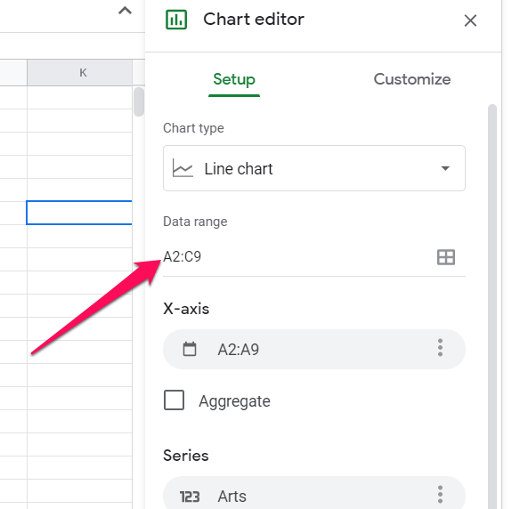
Choose the option for Line Chart or Line Graph in the Chart Type option. You can pick the options pr data that you want to add to the chart. Google Sheets also lets you customize your chart as per your preferences.
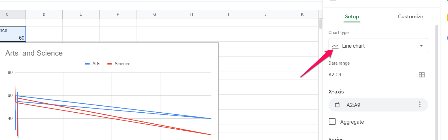
If you are looking to change the data that you want in the Chart on Google Sheets, you can pick them from the Chart Editor.
The video below should perhaps help you understand it in a more streamlined manner.
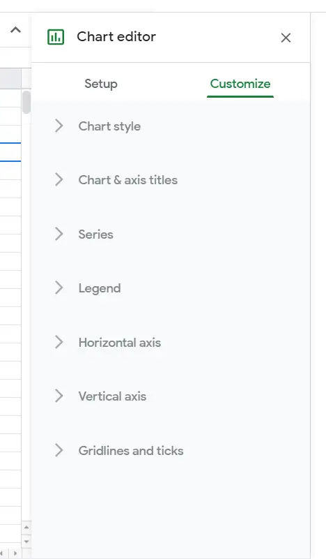
Customize the Line Chart on Google Sheets
The chart you created in the above steps is completely barebones and basic in nature. You may perhaps want to customize it further. Google Sheets lets you even do that. This will help you add the style elements to your chart.
Simply double click on the Line Chart. This will open Customise window. You can use this menu for adding Point sizes, shapes, color, and a wide range of other parameters.
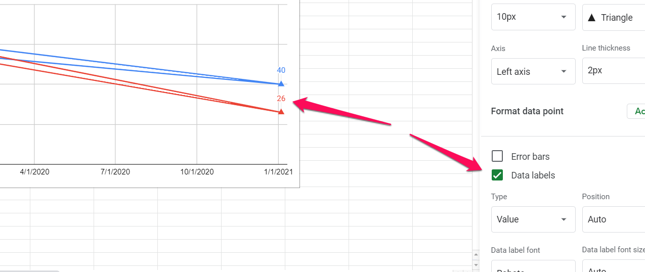
Add Data Points to the Chart
Adding the data points to the chart should be one of the excellent options and help you make your chart stand out. To do this, you can simply go to Chart Editor and then choose Series. In this section, you can check the box for Data labels.
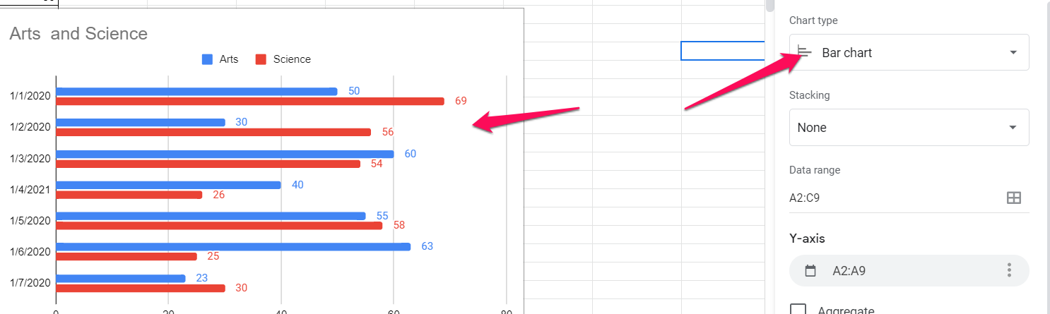
How to Create a Bar Chart in Google Sheets?
Creating a Bar Chart on Google Sheets is quite easy once you have learned how to make a line chart on the Sheets. You can double-click on the chart to open Chart Editor.
Once you are on Chart Editor, select Bar Chart under the Chart Type section.
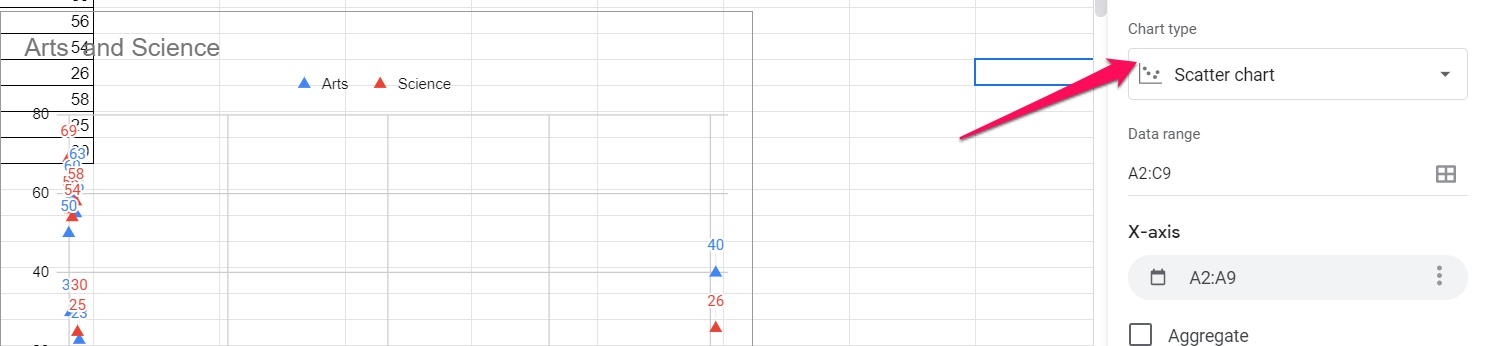
How to Make a Scatter Plot in Google Sheets?
A Scatter plot is a chart that uses coordinates for showing the values in a two-dimensional arena. If you are wondering how to create a Scatter plot on Google Sheets, it offers you a simple and easy option to make a scatter plot without the need for any confusing steps.
Scatter plots can be a great option to show the trends and relationships in data. They can be a great way to show the datapoint clusters which a bar chart or line chart may not be able to show efficiently. Since a Scatter Plot shows the clusters of any data, you will find at which value most of the data is concentrated at.
Select the data in a table you want to create a chart for and insert the chart by selecting Insert -> Chart. Google Sheets will create a default chart. You can change it over to Scatter Chart by double-clicking on the Chart and picking Chart Editor.
Once in Chart Editor, you can simply choose the Chart Type as Scatter Plot. The chart is converted into the scatter plot option.
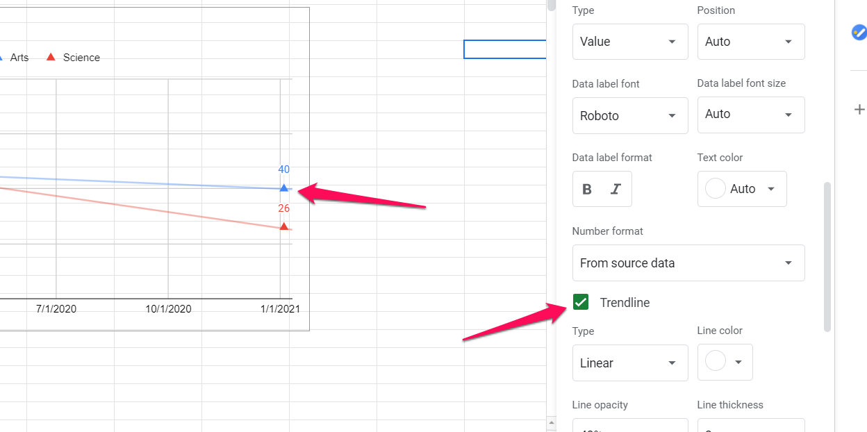
You can even add a Trend line to the Scatter plot if you want to. Go to the Customise option and then pick the Series section. Under the Series section, check the box for Trendline. Google Sheets will add a trendline to the chart.
How to Make A Pie Chart on Google Sheets?
The Pie Chart should be one of the excellent options for creating a Pie chart on Google Sheets. The Pie chart is normally used for displaying the distribution of the data across different categories.
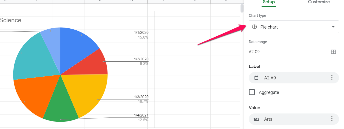
Creating a Pie chart on Google Sheets should be an easy task. Like every other method used for creating a chart on Google Sheets, this method too involves selecting the table for the chart and pick the option Insert -> Chart. Once on the Chart options, select the Chart Type as Pie chart.
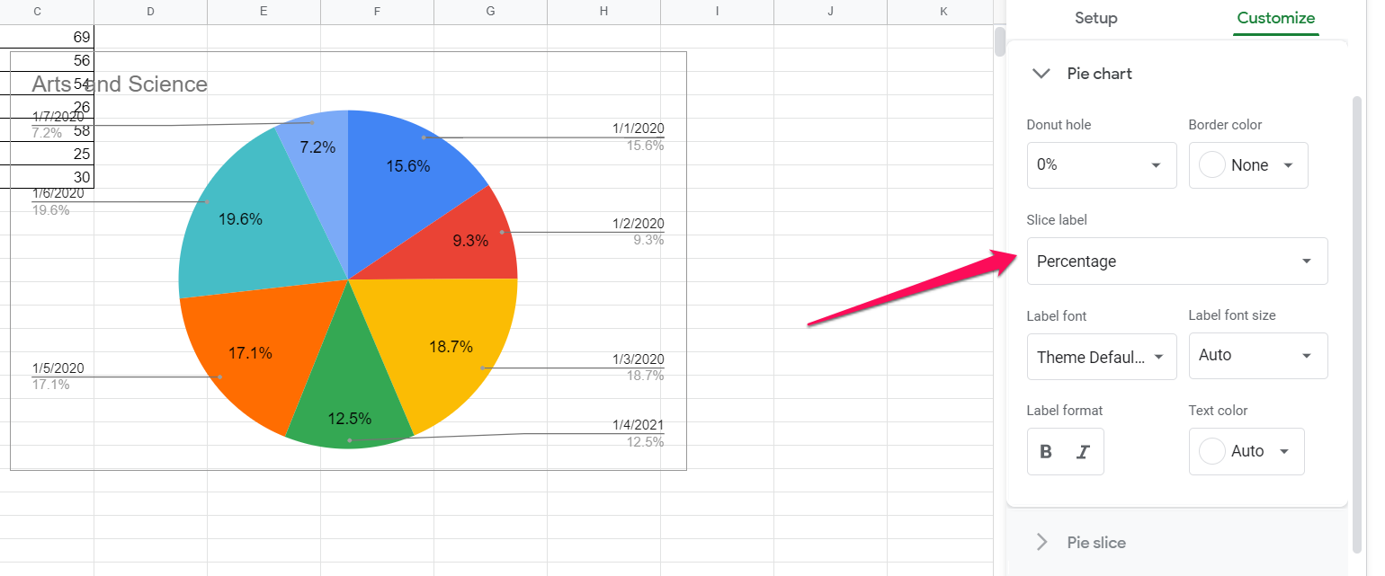
In case you want to show the percentage variation of the Pie chart, you can pick the option Pie chart > Slice label. You should find it under Customise option for the chart. Select the option for Percentage from here.
How to Make a Line Graph in Excel?
In a similar way as creating a line graph on Google Sheets, you can make a line graph in Excel as well.
In fact, it should be much easy creating a line chart on Excel than on Google Sheets since most of us have been better used to the spreadsheet solutions from Microsoft.
The steps should ideally be similar to the methods used in Google Sheets:
Step 1:
Create and select the table you want to create a hart for. You can select the entire table based on the chart in your plans. If you haven’t created a table of the data s yet, that should be the first step in creating a table.
Step 2:
Pick the option for inserting the Line chart. You can use the option for Insert and then pick Charts group. Under the list of Charts group, pick the option for Line Chart.
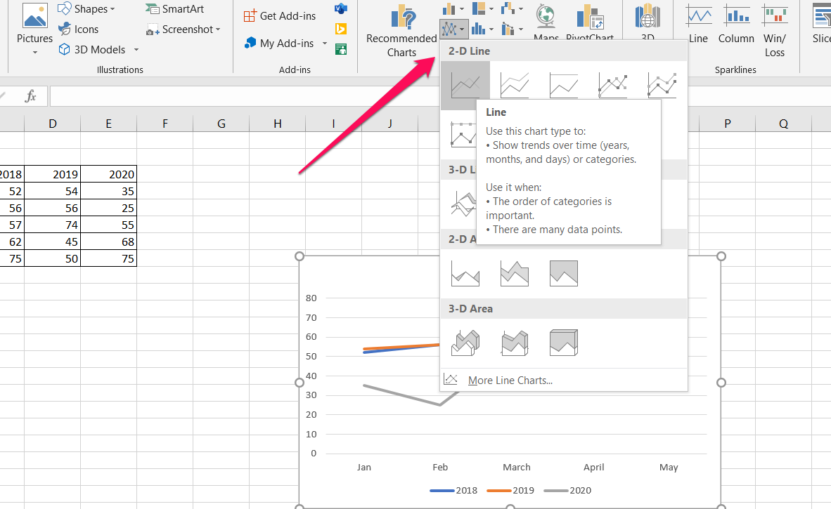
Once you have picked the chart style you want to create, the chart will automatically be created by making use of the data from the table.
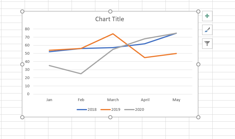
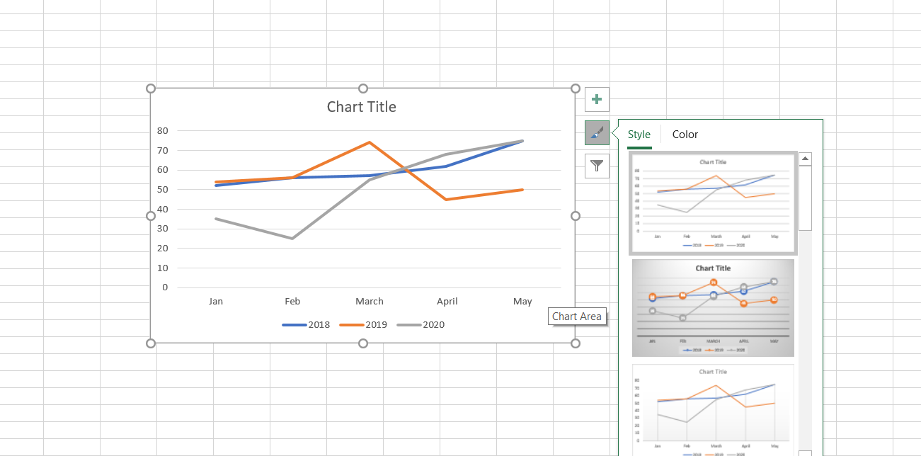
You can then customize the chart by adding the title for the chart. You can customize the chart by clicking on the Chart Styles tab beside the chart and then select the different styles of the chart.
Summing it up…
Creating a chart in Google Sheets is quite simple and easy. In fact, Google Sheets does provide you a very simple option to customize and work with your charts. We would recommend learning the steps for each of the chart types and practicing them for gaining complete input into how to work with the charts.


Add Comment