Google Sheets is definitely a breakthrough in the spreadsheet world. It is a web-based program that allows you to create, edit, and collaborate on spreadsheets online. With its cloud-based nature, multiple users can work on the same spreadsheet simultaneously, making real-time collaboration easy. It offers various formatting options, formulas, and functions for data manipulation and analysis. Office 360, erstwhile MS Excel went online and is still dealing with How Google is capturing the market.
In this piece, I will answer How to make statistical diagrams bar graphs, Pie Charts, Histograms, etc on Google Sheets.
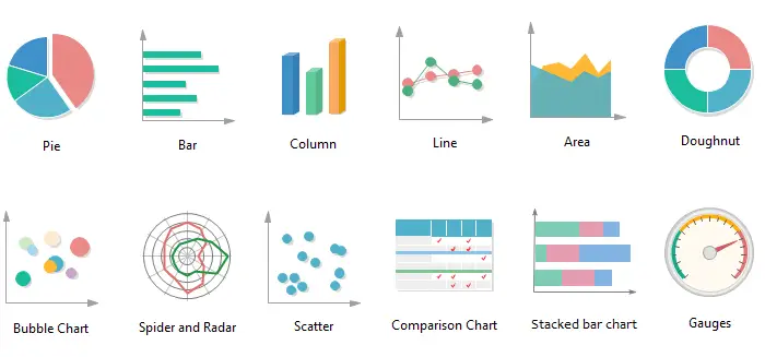
What Is A Bar Graph, Histogram, and Pie Chart?
A bar graph, histogram, and pie chart are all types of visual representations used to display data. Each has its own specific characteristics and is suitable for different types of data analysis. Here’s a brief description of each:
Bar Graph
A bar graph is a chart that uses rectangular bars to represent data. It is used to compare different categories or groups and display their corresponding values. The length or height of each bar represents the quantity or frequency of the data being represented.
Bar graphs are commonly used to show discrete data, such as comparing sales figures for different products or comparing the population of different cities. It is very effective data with set values.
Histogram
A histogram is a graphical representation of data that uses contiguous vertical bars to display the distribution of a continuous variable. It is similar to a bar graph but differs in that it represents continuous data rather than discrete categories.
The horizontal axis represents the range of values, divided into intervals or bins, and the vertical axis represents the frequency or count of data falling within each bin. Histograms are often used to analyze data distributions, such as the distribution of ages in a population or the distribution of test scores. It’s a dataset based on averages. It is not a widely used tool for splitting values and compounding on averages.
Pie Chart
A pie chart is a circular chart divided into slices, where each slice represents a category or proportion of a whole. The size of each slice is proportional to the quantity or percentage it represents. Pie charts are typically used to display the composition or relative proportions of different parts within a whole. They are useful for showing percentages or proportions, such as market shares of different companies or the distribution of expenses in a budget.
To wrap it up, a bar graph is used to compare different categories, a histogram displays the distribution of continuous data, and a pie chart represents the proportions or percentages of a whole. The choice of which type of chart to use depends on the nature of the data and the specific insights you want to convey. It is great to ascribe a portion of a category irrespective of the quantity it represents.
Bar Graph Vs Histogram Vs and Pie Chart – Tabular Comparison
| Feature | Bar Graph | Histogram | Pie Chart |
|---|---|---|---|
| Type of Data | Categorical or numerical data. | Numerical data (continuous or discrete). | Categorical data (usually with few categories). |
| Representation | Vertical or horizontal bars showing frequencies. | Bars representing data ranges; no gaps between bars. | Slices of a circle representing proportional data. |
| X-axis | Represents categories or groups. | Represents the data range (bins or intervals). | Represents categories (usually labeled with names). |
| Y-axis | Represents the frequency or value of each category. | Represents the frequency (count) of data in each bin. | Represents the percentage or proportion of each slice. |
| Data Range | Each category is distinct; no overlap. | Data grouped into intervals (bins). | Categories with corresponding proportions. |
| Use Cases | Comparing values among different categories. | Displaying frequency distribution of continuous data. | Showing proportions or percentages of different parts. |
| Data Types | Nominal or ordinal data; discrete or continuous. | Continuous data (often grouped into intervals). | Categorical data; should add up to 100% (or 360°). |
| Gaps | Gaps between bars to separate categories. | No gaps between bars; adjacent bars touch. | No gaps; entire circle used to represent 100%. |
| Example | Number of students in different classes. | Distribution of test scores in a class. | Market share of different companies in a market. |
| Limitations | Limited to representing a small number of categories. | Bins can affect the appearance of data distribution. | Not suitable for complex data representation. |
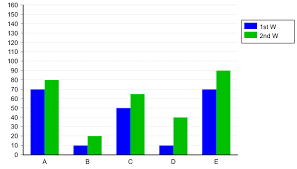
How to Make A Bar Graph in Google Sheets?
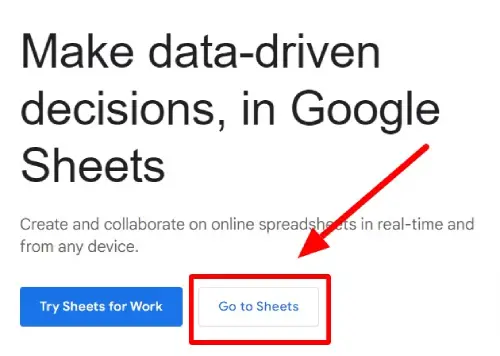
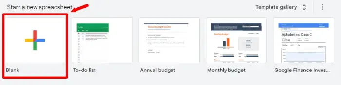
Step 1: Open a new Google sheet file and name the file
- Access Google Sheets from here.
- Now click on ‘Go to sheets’.
- Now click on the ‘blank’ option on the right-hand side.
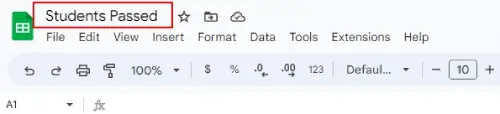
- In the corner right, you will see the Untitled Spreadsheet written at the top. Click on the text and the edit bar will appear, change the file name according to your choice. Since we will deal with ‘school students pass percentage hence we will name the file ‘Students Passed’.
Step 2: Fill in your data
- Enter your data in a table format.
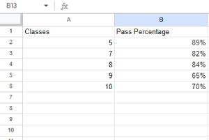
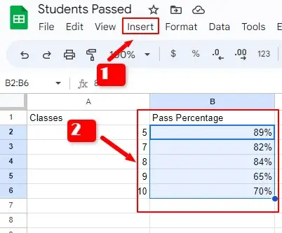
- In the first column, add the categories or labels for your bars. In our case, we will take the column heading ‘classes’ of 5, 7, 8, 9, and 10.
- And in the second column, enter the corresponding values for each category. In this case, we will plot the percentage of students who passed hence the column heading will be ‘passed’.
Step 3: Set the data range for the values
- Select the data range that you want to include in your bar graph. See 2 in the below image.
- This can be done by clicking and dragging your mouse over the cells containing the data.
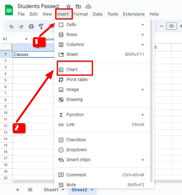
- Click on the ‘Insert‘ tab in the menu bar. See 1 in the below image.
Step 4: Plot Chart
- Select ‘Chart‘ from the drop-down menu.
- This will open the chart editor sidebar on the right side of the spreadsheet.
- In the sidebar, click on the ‘Chart type‘ dropdown and choose ‘Bar‘ or ‘Column‘ depending on your preference.
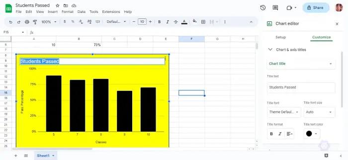
- Customize your graph by adjusting various settings in the sidebar. You can modify the title, axes, colors, labels, and other visual elements to suit your needs.
- If you find the options confusing, you can double-click on any element of the graph and it will open the font and background editing option as shown in the below image.
- For instance, in the below image, I double-clicked on the title, and the chart title opened in the sidebar. You can edit every property via the sidebar of the title.
Step 5: Include bar graph data with the text
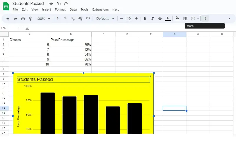
- Preview your bar graph in the sidebar to see how it will look.
- Once you’re satisfied with the appearance of your bar graph, move and place the bar diagram wherever you want.
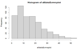
How to Create a Histogram in Google Sheets?
In order to make a histogram in Google Sheets, follow these steps:
Step 1: Enter the required data
- Open Google Sheets and create a new or open existing spreadsheet.
- Enter your data into a column. We will be using a different dataset than we used for the bar graph. Just like stable values in a bar chart, Histogram is a chart of averages, the frequency occurrence of the variable.
- Here we will plot the histogram of ‘students and their marks’.
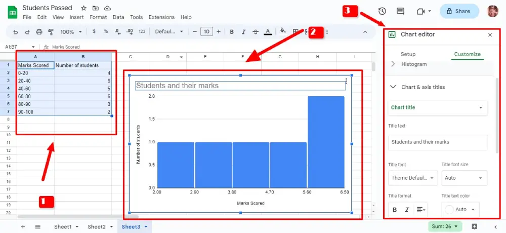
- Click on the ‘Insert‘ menu at the top and select ‘Chart‘ from the dropdown. See 1 and 2 in the below image.
Step 2: Place the Historiogram on the main body of the text
- In the Chart editor, choose the ‘Chart type‘ as ‘Histogram‘ from the left panel. See no 3 in the below image.
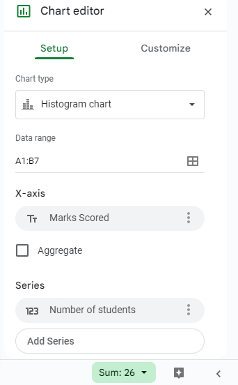
- Customize the chart settings as desired, such as the chart title, axis labels, and colors.
- Click on the ‘Insert‘ button to insert the histogram chart into your Google Sheets.
- Do remember that a Historiogram chart is a chart of averages you see only the average differentiation between the variable plotted.
- The data values can be seen in no 1.
- You can see the diagram of the Histogram below no. 2 in the image.
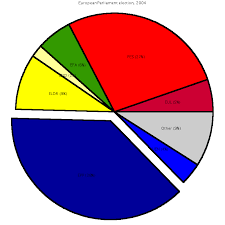
How to Create a Pie Chart in Google Sheets?
Step 1: Feed the values
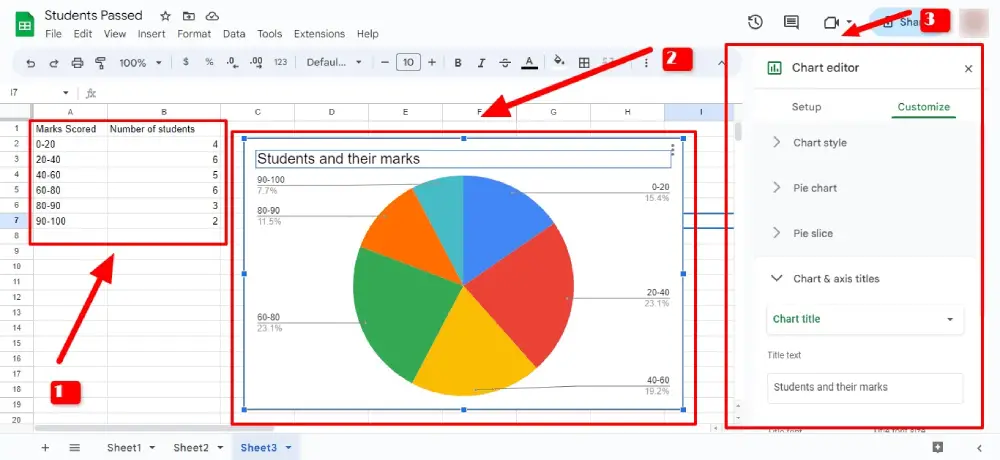
- Use the same values that we have used for a histogram. See no 1 in the below image
- In a pie chart, the sections of a circle are determined by the prior values ascribed to the given values. The circle then is comparatively broken into parts 0f 100%.
Step 2: Plot a Pie Chart
- Go to ‘Insert’ then select ‘chart’.
- The chart editor will open on the sides.
- Select ‘Pie chart’ from the drop-down list of chart types. See no 3 in the below image.
- Hence, it’s done. For a piechart preview, see no 2 of the below image.
FAQs
What is the significance of using a bar graph, histogram, or pie chart?
Bar graphs, histograms, and pie charts are powerful visual representations that help us understand and analyze data effectively. They provide insights into comparisons, distributions, and proportions, aiding decision-making and communication of information.
When should I use a bar graph instead of a histogram or pie chart?
Use a bar graph for categorical or discrete data when comparing different categories. Histograms are suitable for displaying distributions of continuous data, while pie charts represent proportions within a whole.
Can I create these statistical diagrams in Google Sheets, and how can I do it?
Yes, you can create bar graphs, histograms, and pie charts in Google Sheets. Enter data, select the range, click “Insert” > “Chart,” choose the chart type, and customize it.
What are the limitations of using pie charts, histograms, and bar graphs?
Bar graphs may become cluttered with a large number of categories. Histograms can be influenced by bin choices. Pie charts might not be suitable for complex data or similar proportions.
How can I collaborate with others using Google Sheets to work on these diagrams together?
Share the Google Sheets file with collaborators via email or a shareable link. They can view, edit, and contribute to the diagrams and data analysis in real time.
Conclusion
Do you want to make pie charts, histograms, bars, etc to represent data visually? If you use Google Sheets then your task will be accomplished. In this piece, I have explained in very simplistic terms the steps involved in the process of making such data-based representations and visualizations.


Add Comment