It’s sometimes said that programming an app is easy – designing a UI is the hard part. There are always exceptions, but it can generally be said that programmers do not enjoy designing UIs. Theories abound – is it because programmers simply focus on making a product work, and designing a fancy GUI is seen as extraneous?
Designing an appealing UI/UX doesn’t have to be a chore – in fact, simpler is often better. Having an ultra-fancy UI is a bit like having a splash landing page on your website. It’s kind of cool the first time you visit it, and then honestly you wish it would just go away (thankfully, splash pages have pretty much gone away).
In this article, we’ll be highlighting the top UI/UX design trends for mobile apps in 2019, with a key focus on simplistic, yet appealing design that will allow your apps to stand out, without spending hours in the drawing room.
Material Design
 For the tried-and-true, you can’t go wrong with sticking to plain old Material Design, which was developed by Google (hence why they recommend it so much). Material Design’s core focus is a simplified color palette and smooth, card-based UX layout – and really, it just works.
For starters, Google spent a ton of resources on formulating the Material Design guidelines, working with some of the greatest designers in the industry, and then just gave the whole thing away for free. I mean, people pay hundreds of dollars for app design e-books, and along comes Google, with probably the most easily accessible and simply appealing UI/UX guideline, and just gives it to the world.
A handful of the most popular Android apps are already using Material Design (SwiftKey, Action Launcher 3, Nova Launcher, Lyft, Textra SMS, just to name a few) – so unless you’re planning on “re-inventing the wheel”, why shouldn’t you be also?
Color Gradient
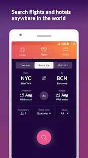
 Another simple and accessible design theme is color gradients. Color gradients give your UI/UX a sort of rich, fun appeal, depending on the gradient palette used. But it’s really so easy to start experimenting with color gradient design, I mean Photoshop or Illustrator can do like 90% of the work for you. Right-click empty layer > Blending options > Gradient overlay. Adjust as necessary.
I mean look at that mock-up. I literally did the gradient background in 10 seconds, and another 10 seconds for the button and typography. Is it ugly? Probably, it was done in 10 seconds. But just imagine what you can do in 10 minutes, especially if you just pick a pre-made gradient from a website like UIGradients. Come on, programmers! This is elementary stuff! It doesn’t have to be as difficult as Life the Game.
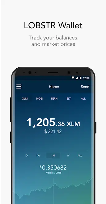
Some great gradient (greatient?) inspiration can be found by looking at apps like Lobstr and Carrot Weather.
Night Mode
Something Facebook can’t seem to understand is how much app users really appreciate a “night mode” UI/UX theme. Basically, if your app’s main theme focuses on bright colors, especially with a white background, your users’ eyes are going to be really uncomfortable at night – hence why it’s a great idea to include a “night mode” (AKA dark theme) that can easily be toggled on an off. Even something as simple as inverting the colors does wonder.
Reddit, Youtube, Opera, Twitter, Firefox… the list of top apps realizing the importance of a night / dark mode is growing. Facebook promised one back in May, but I guess wacky filters for “My Day” photos are a bigger priority than not burning out users’ retinas. Don’t be like Facebook.
Simple Navigation
 People really don’t want the screen to shake, shoot fireworks, and play sounds whenever they press a button in your app. They just want whatever they pressed to open. That’s it. All you need is clear typography (Roboto works wonders), neatly organized menus, some nice colors, and leave it at that. Like, when I click “Play” in the Surviv.io game, you know what it does? It takes me right into the game. Imagine that.
Anything beyond is just extraneous and eventually annoying to the user – not to mention more than likely drag on the user’s battery. I mean think about it – if your app is shooting animations everywhere every time I change menus, it’s probably being chucked in my “Battery Hog” bin.
SVGs and You
If your app is using graphical elements that scale based on user resolution, you need to start using SVGs instead of any other image format. This might be “old news” for people in the digital art industry, but it’s mind-boggling how many app developers are still using PNG / JPG elements in 2019.
SVGs (Scalable Vector Graphics) do not lose quality when scaled up or down. So, for example, let’s say you have a 150×150.PNG file. It can be your logo, or a picture of a cat, or whatever – it looks great on certain screen resolutions. But when this PNG gets upscaled to a higher screen resolution, it suddenly becomes blurry and pixelated. SVG images do not lose image quality.
Not only that, but SVGs can also be up to 60% to 80% smaller in file size than PNG. So if you want your app to load faster, while your graphical elements look awesome at any resolution, do yourself a huge favour and start using SVG wherever possible.


Add Comment